

How to Use Animal Print in a Way That Feels Elevated (Not Overdone)
Animal print is more versatile than people think. It doesn’t have to read bold or flashy—in fact, when used thoughtfully, it can feel quiet, layered, and surprisingly refined.
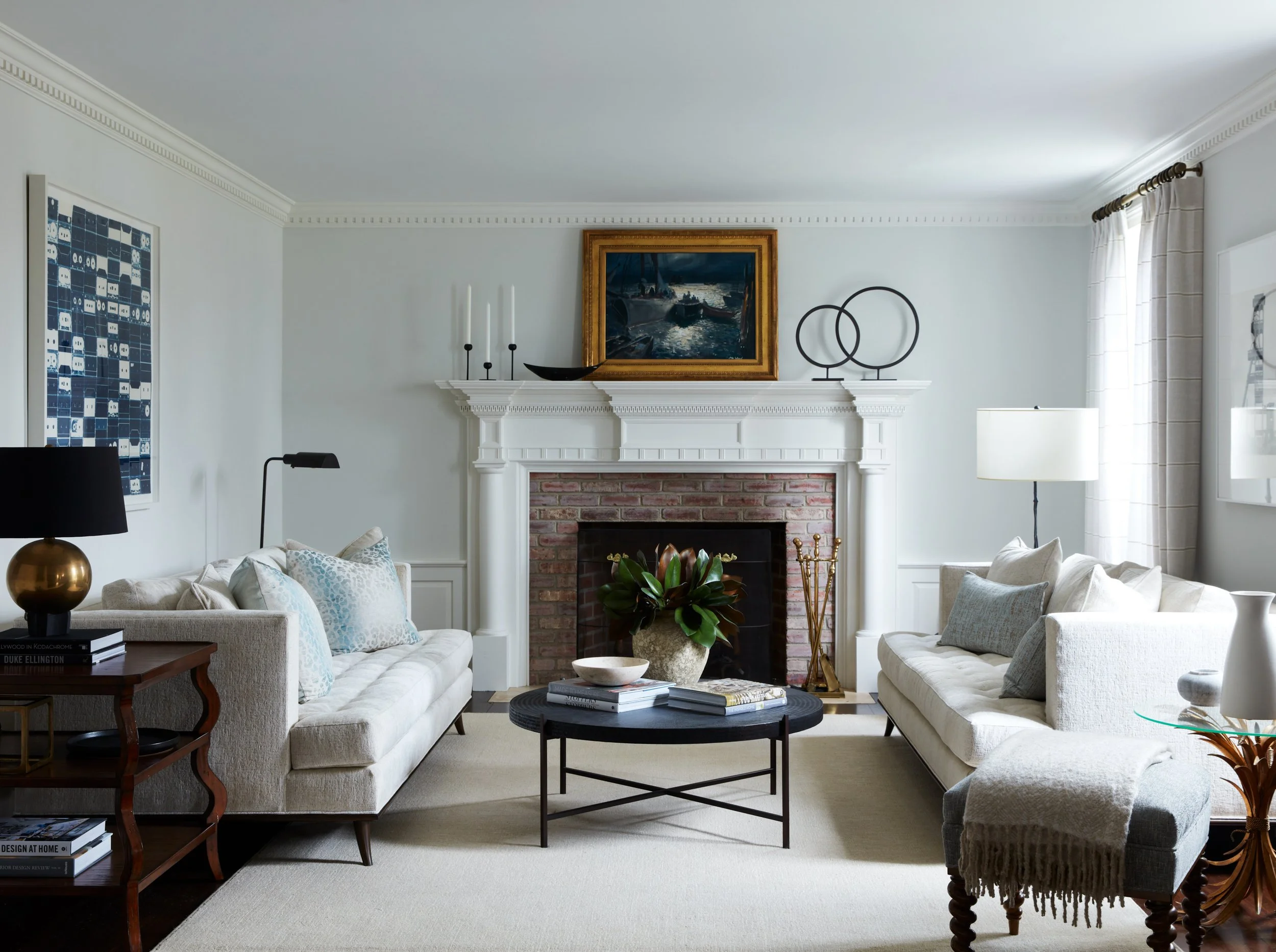
Subtle animal print layered into a neutral Westchester living room.
In our projects throughout Westchester County and beyond, we tend to gravitate toward smaller-scale leopard or cheetah prints in warm, tonal palettes. They blend more seamlessly into a space and act almost like a neutral, especially when layered into living rooms or bedrooms. A pillow, a bench, or an accent chair is usually enough to introduce the pattern without overwhelming everything else.
What makes animal print work is restraint. When everything else in the room is grounded—clean upholstery, tailored silhouettes, a controlled color palette—the pattern reads as intentional rather than decorative. It becomes another layer, not the focal point.
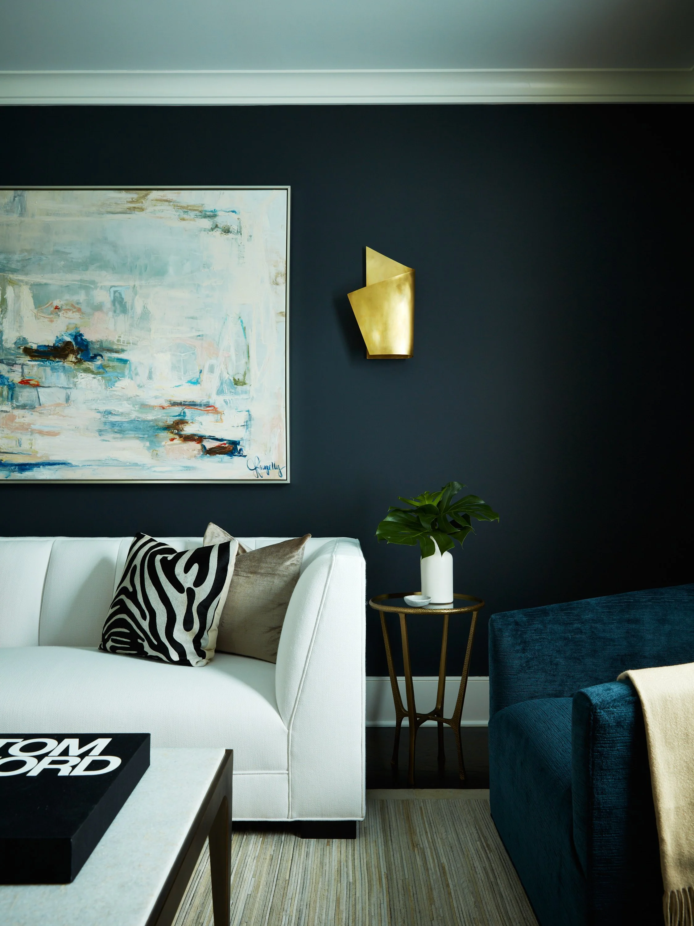
The pairing is just as important. Animal prints work especially well with ivory upholstery, deep navy for a bit of contrast, and warm brass accents that give the whole room a polished feel. Mixing in solid textures like linen, wool, and velvet helps soften the look and keeps it from feeling too busy or trend-driven.
We also like using animal print to break up rooms that feel a little too “safe.” In more neutral spaces, it adds just enough movement and variation without introducing a new color story. It’s one of those subtle shifts that makes a room feel more finished.
That said, we typically avoid using animal print in permanent applications or at a large scale. Upholstery, rugs, or wallcoverings in these patterns can quickly take over a space. Keeping it more flexible—through pillows, small upholstered pieces, or layered accents—allows it to enhance a room rather than define it.
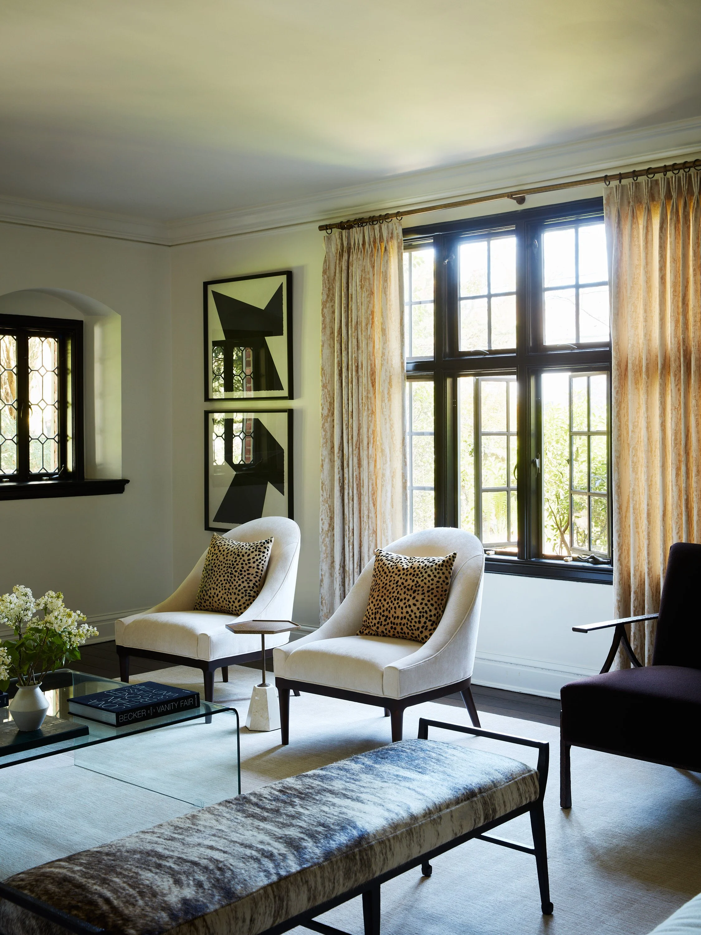
Photo Credit: Tim Lenz
The goal is always the same: add depth, texture, and a bit of personality—without letting it steal the show.